LaTeX is built on the top of plain TeX macros, which is a powerful typesetting language developed by Donald Knuth. Therefore, LaTeX has almost, if not all, of the TeX typesetting potential. In this post, we will consider 6 typesetting capabilities in order to make our articles, reports and books look more professional. So let’s explore some of these possibilities:
Tip 1: Quotes in LaTeX
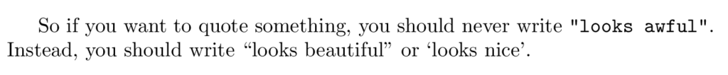
First of all, you should consider the fact that, although your keyboard has only one type of double quotation marks, namely ", in books there are two:
- opening quotation marks “ and,
- closing quotation marks ”.
In LaTeX, the first symbols are left-quote characters while the last are right-quote or apostrophe characters, which can be obtained using left quote command \lq and right quote command \rq., repeating the command twice will create a double quotation mark. Here is an example:
% Quotes in LaTeX
\documentclass{article}

\begin{document}
So if you want to quote something, you should never write \verb|"looks awful"|. Instead, you should write ``looks beautiful'' or \lq looks nice\rq.
\end{document}
Compiling this code yields:
Tip 2: Dashes in LaTeX
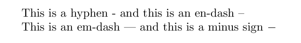
With respect to dashes, good math books have, at least, four kind of different symbols: a hyphen (-), an en-dash (–), an em-dash (—) and a minus sign (−). Hyphens are used in compound nouns such as right-quote. En-dashes are used for intervals of numbers such as 4–6. Em-dashes are used for punctuation in sentences—for instance, when you want to avoid a parenthesis at the end of a sentence. Finally, minus signs are used in formulas, usually to denote the difference between two numbers.
If you want a professionally typeset document, you should be aware of this four cases, which you can write as: hyphen -, en-dash –, em-dash — and minus sign \verb|$-$| . Here is the corresponding LaTeX code:
% Quotes in LaTeX
\documentclass{article}

\begin{document}
This is a hyphen - and this is an en-dash --

This is an em-dash --- and this is a minus sign $-$
\end{document}
Compiling this code yields:
Tip 3: Ties in LaTeX
Another important aspect of TeX and LaTeX typesetting that you probably haven’t heard about are ties. Ties help TeX know when lines should be broken, in order to avoid line breaks that may make reading a sentence difficult. In order to understand the importance of ties, let me cite the creator of TeX Donald Knuth. In the TeX book he asserts that
TeX provides a convenient way to avoid psychologically bad breaks, so that you will be able to obtain results of the finest quality by simply giving a few hints to the machine.
“Ties”— denoted by ~ in plain TeX—are the key to successful line breaking. Once you learn how to insert them, you will have graduated from the ranks of ordinary TeXnical typists to the select group of Distinguished TeXnicians. And it’s really not difficult to train yourself to insert occasional ties, almost without thinking, as you type a manuscript.
Donald Knuth
So when you type ~, it is the same as typing a space, but TeX won’t break the line at this space. You shouldn’t leave any blanks next to the ~, since they will count as additional spaces. Furthermore, since the return key in the input file is the same as a blank space in the output, you should never put a ~ at the end of an input line, since it will produce an extra space.
For example, you may want to use the tie in the following situations:
- Add an abbreviation before someone’s name, e.g., Dr.~House. In this case, this serves a second function too that is worth mentioning. TeX{} puts extra space after punctuation marks in sentences, to make them look better. In fact, if you force TeX{} to stretch or shrink a sentence, it will mainly change this after punctuation mark spaces. But when you are typing an abbreviation, you don’t want a punctuation mark space; instead, you want a normal space. The tie, in this situation, also puts a normal space.
- In references to named parts of the document: Chapter~2, Appendix~B, Figure~3.5, Theorem~1.2, etc.
- Between a person’s forenames and between multiple surnames: Elizabeth~II, Johannes van~der~Waals, Donald~E. Knuth.
You may think that TeX should handle this particular cases by itself, but Knuth doesn’t consider this a possibility. As he says:
It would be nice to boil all of these rules down to one or two simple principles, and it would be even nicer if the rules could be automated so that keyboarding could be done without them; but subtle semantic considerations seem to be involved. Therefore it’s best to use your own judgment with respect to ties. The computer needs your help.
Donald Knuth
Although you may not believe it, sometimes TeX needs your help.
Tip 4: Ligatures in LaTeX
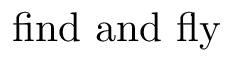
Let’s now dive into what TeX automatically does to make your documents look better, and how can you change it in the (rare) case it doesn’t come out well. First of all, TeX makes ligatures, which are certain combinations of letters that are treated as a unit in book printing. For example, look closely at the first two letters in “fly” and “find” in the following illustration. The letters that clash are substituted for a single symbol, “fi” and “fl” in these cases, which look much better.
In rare occasions you are faced with a word like “shelfful”, which looks better without the ligature in the two consecutive f’s. In this case, we can fool TeX into thinking that there is no such ligature, for example using grouping: {shelf}ful and shelf{}ful.


and here is the corresponding LaTeX code:
% Ligature in LaTeX
\documentclass{article}

\begin{document}
\textbf{With Ligature:} shelfful
\textbf{Without Ligature:} {shelf}ful and shelf{}ful
\end{document}
Tip 5: Dots in LaTeX
Finally, I would like to explain some more details about the spacing rule mentioned in the ties situation. As I said, TeX puts extra space after punctuation marks, because it makes sentences look better. But this can be a problem too, since sometimes TeX may think we are ending a sentence when we are not, adding some awkward spacing. Besides the above-mentioned example, there’s a common situation where you want to prevent TeX from adding extra space and it is when you use an ellipsis of three dots in the middle of a sentence.
For instance, if I just write three dots in a row it looks awful since the dots are too close together and they leave too much space, which loses part of the ellipsis effect:

In order to prevent this undesired effect, plain TeX has the control sequence \ldots which yields the desired result as shown below:

and the corresponding LaTeX code:
% Dots in LaTeX
\documentclass{article}

\begin{document}
Three dots... in the middle of a sentence
Three dots\ldots in the middle of a sentence
\end{document}
Conclusion
And that’s all for this tutorial. I’m sure from now on you will be more aware of your document’s fine tuning and appearance, to make it look as the work of a professional typist, but made at home with your personal computer. This is the spirit of a true TeXnician.